Tiny text is the plan, the plan is death
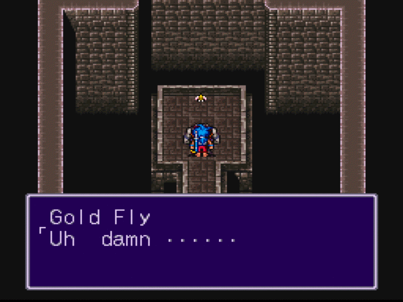
No mistaking what that fly is saying in Breath of Fire, that's for sure. This font size guarantees readability. Some might say this is a little too big. However, compare this font size with that of any modern game, and it's clear which gaming generation pandered to the literate more. Either way, this is a problem, and while not every videogame suffers from it, many big name titles shockingly do.
Tiny text is fairly contemporary, having only begun to infect our gaming consoles somewhere around 2006 with Dead Rising. The walking dead were not the only challenge players had to deal with in Capcom's newest survival horror adventure for the latest next-gen console. A small font size made reading mission objectives difficult. It turns out that Capcom developed the game specifically for high-definition televisions, backslapping an entire cut of gamers for their lack of fancy new tech. When the community complained, Capcom sort of listened, offered an apology, and basically said the only way around the tiny text problem was to fiddle with your TV's settings and hope for the best. In short, DIYYBOYBTFBOG (do it yourself, you bunch of yahoos, but thanks for buying our game).
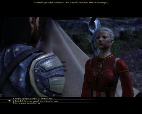
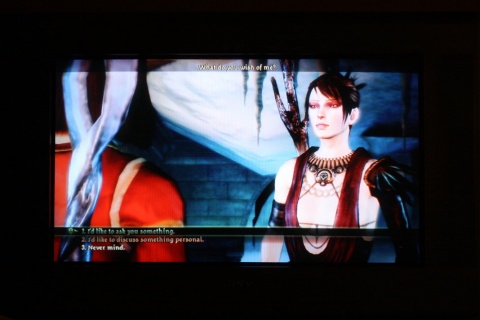
Strangely, also at fault for using tiny text is BioWare. The BioWare. And that's weird because their games are heavy on the lore, and to fully immerse one's self in Mass Effect's universe or the Dragon Age: Origins's Ferelden, it's vital to read every scrap of flavor text, every piece of data added to your in-game lexicon. Heck, even the dialogue is often hard to read, meaning one does have to listen to a drunken Oghren for the entire time he's in their party. Let's look at a screenie:
On consoles, this is what a dialogue between characters looks like. Like a widescreen DVD, stretched across and surrounded by a lot of extra black space. WHICH IS NOT USED. Why not, then, make the text bigger? You know...fill the void? There's plenty of space, and it'd be nice knowing exactly what the Grey Warden is trying to intimidate these wood elves into doing.
Anyone know if Gothic IV is any good? I downloaded the demo several months back, got a few minutes in, and immediately quit to the dashboard. While voice acting certainly has come a long way, I still prefer to read, and I read faster than I listen, often skipping ahead to read what they are saying next. RPGs with tiny text are like swords with dull edges, guns with Nerf bullets, non-alcoholic beer. What's the point?
Let me make this perfectly clear to all you First Hour readers: I do not condone texting while driving. However, in Grand Theft Auto IV, I just couldn't help myself sometimes. Yes, there were many accidents, many laughable moments where that jerkhead Niko went crashing through the windshield to taste a little of his own medicine, but the majority of them did not, surprisingly, stem from bad driving. Instead, too much attention was stolen away because the text on Niko's Whiz cell phone was way too small to read. You want to what with my what, Brucie? Eww.
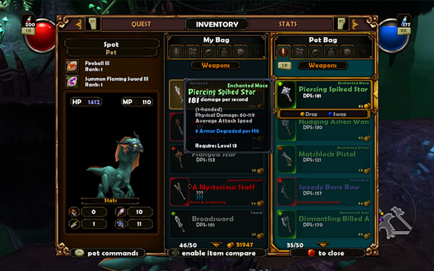
Lastly, there's Torchlight, a Diablo clone I was very excited to try out once it was ported to Xbox Live Arcade. Its greatest bullet point is its wondrous amount of loot. Alas, loot needs to be compared before selling to ensure you're wielding the greatest staff possible, the strongest armor, the best belt, the most potent fish, and so on. I tried using the power that is Google, but my searching-fu failed me, and I was unable to find a really quality image of two weapons being compared. See, when the two items are compared, the second item's details are always shown in a separate box about three-fourths the size of the original, and demons abound if that weapon has a ton of stats to it. Impossibly frustrating to decipher. Here's a screenshot though:
I suggest you take several steps away from your monitor, as if you were playing it on a console, and then trying to read what rank Spot's fireball is.
I don't have the World's Best TV and probably never will. Mine's roughly five years old, and many games play perfectly fine on it, such as Fallout 3, Borderlands, and Assassin's Creed: Brotherhood. Others like those titles mentioned above...not so much. When my frustration reaches its peak, I attempt to look like I know stuff and play around with some of my TV's settings. Nothing seems to help though. I've also heard from others that actually rock an HD TV having the same tiny text problems as us peasants. It's a real shame that standard definition TV folk like myself have to suffer for the upswing of technology. Why can't developers work in an alternate option setting? Like, how you can watch a DVD on widescreen or full screen depending on how you place it in the tray. Something like that. Please? My eyes--cracked, dry, red-rimmed--are truly begging for this.
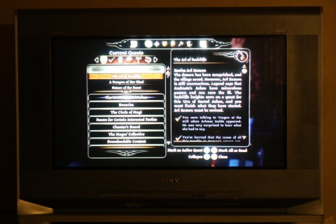
Bonus note from Greg: I've got an HDTV that's on the small side, and I sit decently far away from it making some games like Dragon Age: Origins and Mass Effect quite a bear to read. Here are two pictures I took of my television playing Dragon Age: Origins. Just imagine yourself sitting a few more feet back from that.

